Colour
Colour is a strong motivator and often the most memorable aspect of a printed image. Consistent use of Ivey Business School primary colour palette is vitally important to our corporate identity and reinforces our promise to be one of Canada's pre-eminent university Faculties.
Green is an integral part of Ivey's history and identity.
Purple is integral to Western University as an educational institution and community.
Support colours to be used in conjunction with these two colours are gray, black and white as shown.
The restrained colour palette is essential to capturing and conveying the Ivey brand. Please do not use any unapproved colours, or create a new colour palette, if you require assistance please contact marketing@ivey.ca.
Note: Results may vary based upon computer colour profiles, substrate, printing processes and screen calibrations. Colour breakdowns should be proofed against the actual PMS swatches whenever possible.
Primary Colour Palette

Ivey Green
Pantone: 3308
Process: C100, M0, Y60, K72
RGB: R3, G70, B56
Web Hex No. 034638

Western Purple
Pantone: 268
Process: C82, M100, Y0, K12
RGB: R88, G44, B131
Web Hex No. 582C83

Black
Pantone: Process Black
Process: C0, M0, Y0, K100
RGB: R0, G0, B0
Web Hex No. 000000

Grey
Pantone: Cool Gray 10
Process: C0, M0, Y0, K72
RGB: R99, G102, B106
Web Hex No. 63666A

White
Process: C0, M0, Y0, K0
RGB: R255, G255, B255
Web Hex No.: ffffff
Transparency 90%
Secondary Colour Palette

Light Grey
Pantone: Cool Grey 7
Process: C0, M0, Y0, K47
RGB: R151, G153, B155
Web Hex No. 97999B

Warm Grey
Pantone: 416
Process: C28, M18, Y29, K51
RGB: R126, G127, B116
Web Hex No. 7E7F74

Light Warm Grey
Pantone: 414
Process: C13, M8, Y17, K26
RGB: R168, G169, B158
Web Hex No. A8A99E

Sand
Pantone: 4525
Process: C9, M12, Y47, K18
RGB: R197, G183, B131
Web Hex No. C5B783
Tertiary Colour Palette

Bright Green
Process: C28, M0, Y88, K13
RGB: R166, G187, B72
Web Hex No. A6BB48

Turquoise
Process: C100, M0, Y31, K7
RGB: R0, G151, B160
Web Hex No. 0097A0
Typography

Sans Serif
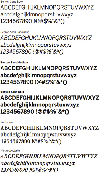
The primary font to be used is Benton Sans. Benton Sans Book is the preferred weight for body copy in publications.
Benton Sans Medium and Bold should be used for headers, sub- headers and call-outs. Do not set entire documents or paragraphs in Benton Sans Medium or Bold.
Benton Sans Bold should not be used for typesetting of large sections of body copy.
Serif
The serif font to be used is Berthold Walbaum. Use should be limited to headlines and main headings. Do not typeset large amounts of copy in Walbaum. If you are uncertain about the use of any of the above fonts please contact marketing@ivey.ca.
PC and web safe
Where Benton Sans is unavailable, the use of Arial is permitted. Additionally, Georgia should be used if Walbaum is unavailable.